源码地址 展示地址
案例来源 - Github - 50+ mini web projects using HTML, CSS & JS开始意识到代码片段的重要性!
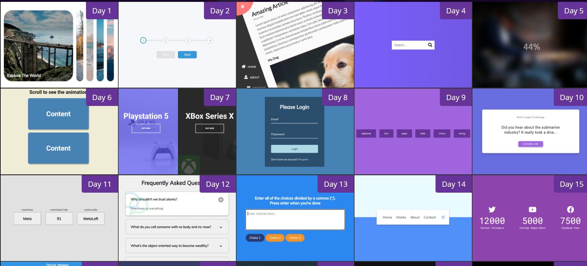
按数量划分,思考关键步骤,实现内容,和交互方式!
功能汇总!记录实现的内容!
点击扩展卡片 - 主要通过flex占有份数实现,Js实现添加类
点击移动下一个 - 通过flex:space-between实现平均分布,Js计算长度,转化成百分百,显示动画
点击按钮 - 整体旋转 - 然后出现导航栏 - 主要靠transform-origin: top left;
搜索框消失 - 点击按钮 - 添加类 - 长度变换!
图片从模糊到清晰 - filter: blur(0px) - 通过Js动态改变 - setInterval
滚动事件 - 信息框左右滚动出现 - 设置移动位置 - 偶数从左边进入 - Js控制添加类的时机,比较!滚动条高度,当前盒子位置
移入放大 - 当前移入位置占全部75%,通过Js控制移入事件,添加类,增加宽度/减少宽度!!! - 主要特色,增加了图层蒙版 - :before设置
输入信息依次浮动 - 先设置好input的动画效果 - 移动Y轴 - 用Js动态写入 - 拼接 - 设置对应的transition-delay
点击按钮,发出对应的声音 - 用Js写入dom,绑定点击事件,排他法关闭所有声音,然后播放当前声音
随机笑话 - 调用接口,获取数据,写入Dom,通过fetch获取信息,然后转为Json,然后写入页面
线上地址
功能
点击图片 - 可展开
思考
图片展开方向?
实现
1
2
3
4
5
6
7
8
9
10
11
12
13
14
15
16
17
18
19
20
21
22
23
24
25
26
27
28
29
30
31
32
33
34
35
36
37
38
39
40
41
42
43
44
45
46
47
48
49
50
51
52
53
54
55
56
57
58
59
60
61
62
63
64
65
66
67
68
69
70
71
72
73
74
75
76
结构 div.container div.panel active * 4 - 图片用样式背景设置 - background-image:url h3 - 文字 样式 .container { display: flex; width: 90vw; } .panel { // div.panel background-size: cover; background-position: center; background-repeat: no-repeat; height: 80vh; border-radius: 50px; color: #fff; cursor: pointer; flex: 0.5; // 占有一半 margin: 10px; position: relative; -webkit-transition: all 700ms ease-in; } .panel h3 { font-size: 24px; position: absolute; // 定位 bottom: 20px; left: 20px; margin: 0; opacity: 0; // 隐藏 } .panel.active { // 当前 占 5份 - 这样就实现了展开 - 还不用管方向。。 // 详细记录一下! // 这里是把flex分成几份,是5,其他占2.5,于是就是分了一半 // 加入是10,其他占2.5,于是当前占四分之三! // 这里写的是总的!!!!! flex: 5; } .panel.active h3 { opacity: 1; // 显示 transition: opacity 0.3s ease-in 0.4s; // 带动画的显示! } // 小于480px,宽度边长,隐藏最后两个 - 交互设计考虑的好! @media (max-width: 480px) { .container { width: 100vw; } .panel:nth-of-type(4), .panel:nth-of-type(5) { display: none; } } 逻辑 排他思想 const panels = document.querySelectorAll('.panel') panels.forEach(panel => { panel.addEventListener('click', () => { // 点击 removeActiveClasses() // 调用 panel.classList.add('active') // 添加 }) }) function removeActiveClasses() { panels.forEach(panel => { panel.classList.remove('active') // 全部移除 }) }
线上地址
功能
思考
怎么实现平均分布的?
实现
1
2
3
4
5
6
7
8
9
10
11
12
13
14
15
16
17
18
19
20
21
22
23
24
25
26
27
28
29
30
31
32
33
34
35
36
37
38
39
40
41
42
43
44
45
46
47
48
49
50
51
52
53
54
55
56
57
58
59
60
61
62
63
64
65
66
67
68
69
70
71
72
73
74
75
76
77
78
79
80
81
82
83
84
85
86
87
88
89
90
91
92
93
94
95
96
97
98
99
100
101
102
103
104
105
106
107
108
109
110
111
112
113
114
115
116
117
118
119
120
121
122
123
124
125
126
127
128
129
130
131
132
133
结构 div.container div.progress-container div.progress divcircle button#prev button#next 样式 :root { --line-border-fill: #3498db; --line-border-empty: #e0e0e0; } .progress-container { display: flex; justify-content: space-between; // 实现子元素 - 平均分布 position: relative; margin-bottom: 30px; max-width: 100%; width: 350px; } // 移动动画的背景 .progress-container::before { content: ''; background-color: var(--line-border-empty); position: absolute; top: 50%; /* 垂直居中 */ left: 0; transform: translateY(-50%); /* Y轴 - 根据自身移动 */ height: 4px; width: 100%; // 占全部宽度 z-index: -1; /*层级*/ } .progress { background-color: var(--line-border-fill); position: absolute; top: 50%; /*垂直居中*/ left: 0; transform: translateY(-50%); height: 4px; width: 0%; // 从0开始 - 从无到有 z-index: -1; transition: 0.4s ease; // 动画时间 - 改变长度 } .circle { background-color: #fff; color: #999; border-radius: 50%; height: 30px; width: 30px; display: flex; // 子元素 水平垂直居中 align-items: center; justify-content: center; border: 3px solid var(--line-border-empty); // 这个颜色 transition: 0.4s ease; // 动画 - 改变颜色 } .circle.active { // 通过Js添加 border-color: var(--line-border-fill); } .btn { background-color: var(--line-border-fill); color: #fff; border: 0; border-radius: 6px; cursor: pointer; font-family: inherit; padding: 8px 30px; margin: 5px; font-size: 14px; } /* 点击 - 按钮缩小! */ .btn:active { transform: scale(0.98); } .btn:focus { outline: 0; } /* 禁止选中状态 - 改变颜色 + 鼠标 */ .btn:disabled { background-color: var(--line-border-empty); /*改变颜色*/ cursor: not-allowed; /*鼠标*/ } 逻辑 let currentActive = 1 next.addEventListener('click', () => { currentActive++ if(currentActive > circles.length) { currentActive = circles.length } update() // 改变长度 }) prev.addEventListener('click', () => { currentActive-- if(currentActive < 1) { currentActive = 1 } update() }) function update() { circles.forEach((circle, idx) => { if(idx < currentActive) { // 添加。 circle.classList.add('active') } else { circle.classList.remove('active') } }) const actives = document.querySelectorAll('.active') // 计算当前到哪里了,用百分百表示 - 公式(长度 - 1) / (长度 - 1) * 100 + ‘%’ progress.style.width = (actives.length - 1) / (circles.length - 1) * 100 + '%' if(currentActive === 1) { prev.disabled = true } else if(currentActive === circles.length) { next.disabled = true } else { // 这是什么情况?? prev.disabled = false next.disabled = false } }
线上地址
功能
思考
实现
1
2
3
4
5
6
7
8
9
10
11
12
13
14
15
16
17
18
19
20
21
22
23
24
25
26
27
28
29
30
31
32
33
34
35
36
37
38
39
40
41
42
43
44
45
46
47
48
49
50
51
52
53
54
55
56
57
58
59
60
61
62
63
64
65
66
67
68
69
70
71
72
73
74
75
76
77
78
79
80
81
82
83
84
85
86
87
88
89
90
91
92
93
94
95
96
97
98
99
100
101
102
结构 div.container - 旋转 div.circle-container div.circle - 交互 button#close button#open div.content - 展示 h1 small p h3 img p nav - fixed ul li i a li li 样式 body { font-family: 'Lato', sans-serif; background-color: #333; /*背景底色*/ color: #222; overflow-x: hidden; margin: 0; /*清除默认外边距*/ } /*整体*/ .container { background-color: #fafafa; /*这颜色好看*/ transform-origin: top left; /*设置旋转中心*/ transition: transform 0.5s linear; /*旋转动画*/ width: 100vw; min-height: 100vh; padding: 50px; } .container.show-nav { /*出现导航栏*/ transform: rotate(-20deg); /*旋转动画*/ } /*左上角切换按钮*/ .circle-container { position: fixed; top: -100px; left: -100px; } .circle { background-color: #ff7979; height: 200px; width: 200px; border-radius: 50%; position: relative; transition: transform 0.5s linear; } .container.show-nav .circle { transform: rotate(-70deg); } nav { position: fixed; /*浏览器定位*/ bottom: 40px; left: 0; z-index: 100; /*层级*/ } nav ul { list-style-type: none; padding-left: 30px; } nav ul li { text-transform: uppercase; color: #fff; margin: 40px 0; transform: translateX(-100%); /*这没啥用。。*/ transition: transform 0.4s ease-in; } nav ul li i { font-size: 20px; margin-right: 10px; } nav ul li + li { margin-left: 15px; transform: translateX(-150%); } /*选择所有紧跟在 <div> 元素之后的第一个 <p> 元素*/ nav ul li + li + li { margin-left: 30px; transform: translateX(-200%); } 逻辑 添加 / 移除 类 open.addEventListener('click', () => container.classList.add('show-nav')) close.addEventListener('click', () => container.classList.remove('show-nav'))
线上地址
功能
思考
搜索框变长,按钮如何移动? - transform: translateX(198px); /向右移动 - 和搜索框变大而移动! /
实现
1
2
3
4
5
6
7
8
9
10
11
12
13
14
15
16
17
18
19
20
21
22
23
24
25
26
27
28
29
30
31
32
33
34
35
36
37
38
39
40
41
42
43
44
45
46
47
48
49
50
51
52
53
div.search input button --------------- .search { position: relative; /*定位*/ height: 50px; } .search .input { background-color: #fff; border: 0; font-size: 18px; padding: 15px; height: 50px; /*这里要限制宽高 变长用!- */ width: 50px; transition: width 0.3s ease; } .btn { background-color: #fff; border: 0; cursor: pointer; font-size: 24px; position: absolute; /*绝对定位*/ top: 0; left: 0; height: 50px; /*覆盖住搜索框*/ width: 50px; transition: transform 0.3s ease; } .btn:focus, .input:focus { outline: none; } .search.active .input { width: 200px; /*变长*/ } .search.active .btn { transform: translateX(198px); /*向右移动 - 和搜索框变大而移动!*/ } --------------- btn.addEventListener('click', () => { search.classList.toggle('active') // toggle input.focus() // 点击状态! })
线上地址
学习链接
CSS3 calc()是怎么实现计算
功能
思考
实现
1
2
3
4
5
6
7
8
9
10
11
12
13
14
15
16
17
18
19
20
21
22
23
24
25
26
27
28
29
30
31
32
33
34
35
36
37
38
39
40
41
42
body section.bg div.loading-text ------------- .bg { background: url('https://images.unsplash.com/photo-1576161787924-01bb08dad4a4?ixlib=rb-1.2.1&ixid=eyJhcHBfaWQiOjEyMDd9&auto=format&fit=crop&w=2104&q=80') no-repeat center center/cover; position: absolute; top: -30px; left: -30px; width: calc(100vw + 60px); // 计算属性 height: calc(100vh + 60px); z-index: -1; filter: blur(0px); } .loading-text { font-size: 50px; color: #fff; } ------------- let load = 0 let int = setInterval(blurring, 30) // 开启计时器 function blurring() { load++ if (load > 99) { clearInterval(int) // 关闭计时器 } loadText.innerText = `${load}%` // 文字内容 loadText.style.opacity = scale(load, 0, 100, 1, 0) // 从有到无 文字 bg.style.filter = `blur(${scale(load, 0, 100, 30, 0)}px)` // 从无到有!!!图片 } // https://stackoverflow.com/questions/10756313/javascript-jquery-map-a-range-of-numbers-to-another-range-of-numbers // 这公式???? const scale = (num, in_min, in_max, out_min, out_max) => { return ((num - in_min) * (out_max - out_min)) / (in_max - in_min) + out_min }
线上地址
Element.getBoundingClientRect()
window.innerHeight
功能
思考
实现
1
2
3
4
5
6
7
8
9
10
11
12
13
14
15
16
17
18
19
20
21
22
23
24
25
26
27
28
29
30
31
32
33
34
35
36
37
38
39
40
41
42
43
44
45
46
47
48
49
body h1 div.box * 14 h2 ---------------- * { box-sizing: border-box; } .box { background-color: steelblue; color: #fff; display: flex; align-items: center; justify-content: center; width: 400px; height: 200px; margin: 10px; border-radius: 10px; box-shadow: 2px 4px 5px rgba(0, 0, 0, 0.3); transform: translateX(400%); // 默认都在右侧 transition: transform 0.4s ease; } .box:nth-of-type(even) { // 偶数 下标 的时候! transform: translateX(-400%); // 从左进入! } .box.show { transform: translateX(0); // 移动到 0 的位置! } .box h2 { font-size: 45px; } ---------------- const boxes = document.querySelectorAll('.box') window.addEventListener('scroll', checkBoxes) // 滚动事件 checkBoxes() function checkBoxes() { const triggerBottom = window.innerHeight / 5 * 4 // 计算位置 boxes.forEach(box => { const boxTop = box.getBoundingClientRect().top if(boxTop < triggerBottom) { box.classList.add('show') // 添加 类 } else { box.classList.remove('show') // 移除 类!还有可以回去! } }) }
线上地址
功能
思考
实现
1
2
3
4
5
6
7
8
9
10
11
12
13
14
15
16
17
18
19
20
21
22
23
24
25
26
27
28
29
30
31
32
33
34
35
36
37
38
39
40
41
42
43
44
45
46
47
48
49
50
51
52
53
54
55
56
57
58
59
60
61
62
63
64
65
66
67
68
69
70
71
72
73
74
75
76
77
78
79
80
81
82
83
84
85
86
87
88
89
90
91
92
93
94
95
96
97
98
99
100
101
102
103
104
105
106
107
108
109
110
111
112
113
114
115
div.container div.split left h1 a div.split right h1 a ------------- :root { --left-bg-color: rgba(87, 84, 236, 0.7); --right-bg-color: rgba(43, 43, 43, 0.8); --left-btn-hover-color: rgba(87, 84, 236, 1); --right-btn-hover-color: rgba(28, 122, 28, 1); --hover-width: 75%; --other-width: 25%; --speed: 1000ms; } .btn { position: absolute; display: flex; align-items: center; justify-content: center; left: 50%; top: 40%; transform: translateX(-50%); text-decoration: none; color: #fff; border: #fff solid 0.2rem; font-size: 1rem; font-weight: bold; text-transform: uppercase; width: 15rem; padding: 1.5rem; } .split.left .btn:hover { // 按钮移入动画 background-color: var(--left-btn-hover-color); border-color: var(--left-btn-hover-color); } .split.right .btn:hover { background-color: var(--right-btn-hover-color); border-color: var(--right-btn-hover-color); } .container { position: relative; width: 100%; height: 100%; background: #333; } .split { position: absolute; width: 50%; height: 100%; overflow: hidden; } .split.left { /*同一个层级下的类!*/ left: 0; background: url('ps.jpg'); background-repeat: no-repeat; background-size: cover; } .split.left::before { content: ''; position: absolute; width: 100%; height: 100%; background-color: var(--left-bg-color); /*增加纯色蒙版*/ } .split.right { right: 0; background: url('xbox.jpg'); background-repeat: no-repeat; background-size: cover; } .split.right::before { content: ''; position: absolute; width: 100%; height: 100%; background-color: var(--right-bg-color); } .split.right, .split.left, .split.right::before, .split.left::before { transition: all var(--speed) ease-in-out; /*整体设置动画效果*/ } .hover-left .left { width: var(--hover-width); /*通过Js添加! 75%*/ } .hover-left .right { width: var(--other-width); /*25%*/ } .hover-right .right { width: var(--hover-width); } .hover-right .left { width: var(--other-width); } ------------- left.addEventListener('mouseenter', () => container.classList.add('hover-left')) left.addEventListener('mouseleave', () => container.classList.remove('hover-left')) right.addEventListener('mouseenter', () => container.classList.add('hover-right')) right.addEventListener('mouseleave', () => container.classList.remove('hover-right'))
线上地址
功能
思考
如何确认是否添加了内容?input:valid
添加内容方式?
实现
1
2
3
4
5
6
7
8
9
10
11
12
13
14
15
16
17
18
19
20
21
22
23
24
25
26
27
28
29
30
31
32
33
34
35
36
37
38
39
40
41
42
43
44
45
46
47
48
49
50
51
52
53
54
55
56
57
58
59
60
61
62
63
64
65
66
67
68
69
70
71
72
73
74
75
div.container h1 form div.form-control input label div.form-control input latbel button p -------------- .container { background-color: rgba(0, 0, 0, 0.4); padding: 20px 40px; /*内边距 - 内部元素100%*/ border-radius: 5px; } .form-control { position: relative; margin: 20px 0 40px; width: 300px; } .form-control input { background-color: transparent; /*输入框背景透明*/ border: 0; border-bottom: 2px #fff solid; display: block; width: 100%; padding: 15px 0; font-size: 18px; color: #fff; } .form-control input:focus,/*点击 + 值有效*/ .form-control input:valid { outline: 0; border-bottom-color: lightblue; /*鼠标点击时 - 底部边框变色!!!*/ } .form-control label { /*默认样式*/ position: absolute; top: 15px; left: 0; pointer-events: none; } .form-control label span { /*哪里来的span? JS写入!*/ display: inline-block; font-size: 18px; min-width: 5px; transition: 0.3s cubic-bezier(0.68, -0.55, 0.265, 1.55); /*cubic-bezier(x1,y1,x2,y2)*/ /*浏览器可以调节贝塞尔曲线!!!*/ } .form-control input:focus + label span, .form-control input:valid + label span { /*点击 + 有值!*/ color: lightblue; transform: translateY(-30px); /*往上! + 加入了时间变化!transition-delay*/ } -------------- const labels = document.querySelectorAll('.form-control label') // innerText.split('').map((letter, idx) => ``).join(''); 使用map修改原有内容! labels.forEach(label => { label.innerHTML = label.innerText .split('') .map((letter, idx) => `<span style="transition-delay:${idx * 50}ms">${letter}</span>`) .join('') })
线上地址
功能
思考
调整音量??
实现
1
2
3
4
5
6
7
8
9
10
11
12
13
14
15
16
17
18
19
20
21
22
23
24
25
26
27
28
29
30
31
32
33
34
35
36
37
38
39
40
41
42
43
44
45
body audio#id src * 6 - 资源 div#buttons - 按钮 - 事件 -------------- .btn { background-color: rebeccapurple; border-radius: 5px; border: none; color: #fff; margin: 1rem; padding: 1.5rem 3rem; font-size: 1.2rem; font-family: inherit; cursor: pointer; } .btn:hover { opacity: 0.9; /*修改透明度,提示效果!*/ } .btn:focus { outline: none; } -------------- const sounds = ['applause', 'boo', 'gasp', 'tada', 'victory', 'wrong'] // 对应 id sounds.forEach(sound => { const btn = document.createElement('button') // 创建 元素 btn.classList.add('btn') // 添加类 btn.innerText = sound // 添加文字 btn.addEventListener('click', () => { // 添加事件 stopSongs() // 排他! document.getElementById(sound).play() // 播放! }) document.getElementById('buttons').appendChild(btn) // 添加进 大的div }) function stopSongs() { sounds.forEach(sound => { const song = document.getElementById(sound) // 找到! song.pause() // 停止 song.currentTime = 0; // 重置! }) }
线上地址
功能
思考
获取到的数据,还需要转化一下格式!
实现
1
2
3
4
5
6
7
8
9
10
11
12
13
14
15
16
17
18
19
20
21
22
23
24
25
26
27
28
29
30
31
32
33
34
35
36
37
38
39
40
41
42
43
44
45
46
47
48
49
50
51
52
53
54
div.container h3 div#joke .joke button#jokeBtn .btn --------------- .container { background-color: #fff; border-radius: 10px; box-shadow: 0 10px 20px rgba(0, 0, 0, 0.1), 0 6px 6px rgba(0, 0, 0, 0.1); padding: 50px 20px; text-align: center; max-width: 100%; width: 800px; /*定宽度*/ } h3 { margin: 0; opacity: 0.5; letter-spacing: 2px; /*间距*/ } .joke { font-size: 30px; letter-spacing: 1px; line-height: 40px; margin: 50px auto; /*水平居中*/ max-width: 600px; } --------------- const jokeEl = document.getElementById('joke') const jokeBtn = document.getElementById('jokeBtn') jokeBtn.addEventListener('click', generateJoke) generateJoke() // 初始值! // USING ASYNC/AWAIT async function generateJoke() { const config = { headers: { Accept: 'application/json', }, } // 该页面 - 刷新一次 - 即可获得不同的信息!!! const res = await fetch('https://icanhazdadjoke.com', config) //It returns a promise which resolves with the result of parsing the body text as JSON. const data = await res.json() // 返回数据! //{id: 'JmGtkyIJeqc', joke: 'So a duck walks into a pharmacy and says “Give me some chap-stick… and put it on my bill”', status: 200} jokeEl.innerHTML = data.joke // 写入 }
线上地址
功能
思考
实现
1
2
3
4
5
6
7
8
9
10
11
12
13
14
15
16
17
18
19
20
21
22
23
24
25
26
27
28
29
30
31
32
33
34
35
36
37
38
39
40
41
42
43
44
45
46
47
48
49
50
51
52
53
54
55
div#insert div.key ----------- .key{ border: 1px solid #999; background-color: #eee; box-shadow: 1px 1px 3px rgba(0, 0, 0, 0.1); display: inline-flex; align-items: center; font-size: 20px; font-weight: bold; padding: 20px; flex-direction: column; margin: 10px; min-width: 150px; position: relative; } .key small { position: absolute; top: -24px; /* 在 上方! */ left: 0; text-align: center; width: 100%; color: #555; font-size: 14px; } @media(max-width:768px){ .key{ margin: 10px 0px; } } ----------- const insert = document.getElementById('insert') window.addEventListener('keydown', (event) => { // 键盘按下事件!写入dom insert.innerHTML = ` <div class="key"> ${event.key === ' ' ? 'Space' : event.key} <small>event.key</small> </div> <div class="key"> ${event.keyCode} <small>event.keyCode</small> </div> <div class="key"> ${event.code} <small>event.code</small> </div> ` })
线上地址
功能
思考
实现
开始意识到代码片段的重要性!
收集 / 整理 / 归纳!